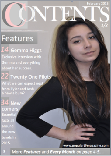
 This is the first version of my music magazine contents page. |  Feedback from the post-its: - Nice, simple font. I like the way the text fits around the image. - Add more images. Looks more like a front cover than a contents page. Features with page numbers, date and magazine website are included. - Nice quality photo, need to add more photo's though. - Make it look more like a pop magazine by using more colours. Add more cover lines. - Nice font choice and its a cool picture. Nice quality. Nice use of the colour pink. - Add more puffs or plugs. I think the picture is not optimal for a contents page. Masthead is too big and looks more like a masthead for a cover. - Good use of the codes and conventions. - I like the use of the colour and I think it helps it look like a pop magazine. |
|
0 Comments
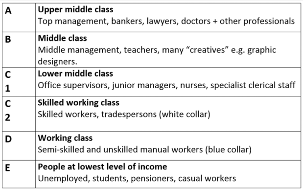 A different classification was done by the advertising agency "Young and Rubican" invented a successful psychographic profile known as their 4C`s Marketing Model (Cross Cultural Consumer Characterisation). They put the audience into groups with labels that suggest their position in society. 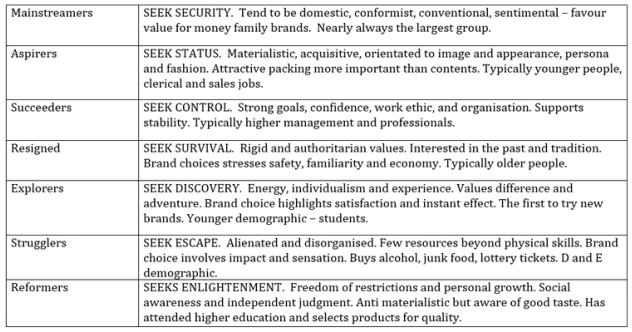 One of the laster approaches to audience targeting has grown out of the field of market research. The LifeMatrix tool defines ten audience categories, centred around both values, attitudes and beliefs and more fundamental demographic audience categories. 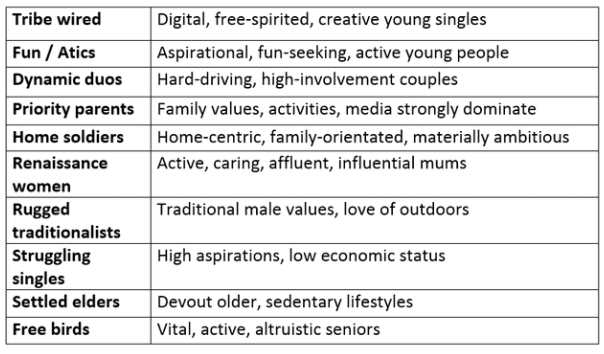 Representation is a key concept in Media education. Understanding the difference between what is real and what is represented is vital to our understanding of any media text.
Important: It is not possible for the media to present the world as it really is. Because the media constructs meanings about the world they change or mediate what is really there. The concept of representation is to do with how the media construct meanings about the world- they re-present it and help us make sense of it. For representations to make sense there must be a shared recognition by audiences of the ideas, values, situations etc. contained in the text. However not all audiences will interpret there meanings in the same way. There is always the possibility of alternative represenatations. Richard Dyer suggests four variations of representation: - A selective Re-presentation of reality: This is obvious in newspapers, where the form is completely different from the events reported, but less so in television serials, which often succeed in creating the illusion of a transparent window world a similar time frame and rhythm to our own. - A typical or representation of reality: Media often use stereotypes to typify particular social groups as a form of shorthand. i.e. gender, race, age, sexuality, disability - The process of speaking on behalf of or as a representative of a particular position. Whose views are being put forward in particular messages? Whose voices are being heard? - The meanings which media messages represent for audiences: What do readers bring to messages which affects how they interpret them? What actual sense is made when particular messages are understand?
Camera angles and camera shots:
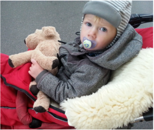
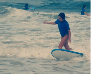
The picture on the left is a medium shot and a slightly high angle. A high angle is a camera angle that looks down up on a subject. This position makes the charakter normally look smaller, submissive, or frightened. A medium shot contains the character from the waist up and is also known as a social shot. The picture on the right is a long shot and an eye-level angle. An eye-level angle puts the audience on an equal footing with the character. This is the most commonly used angle in most films as it allows the viewers to feel comfortable with the character. A long shot contains landscape but gives the viewer a more specific idea of setting. While the focus is on characters, plenty of background detail still emerges. Because of the feedback I have received for my choice of titles, I decided to choose the word Popular as my masthead. After that I searched for different fonts, which I could use for my masthead. This are the ones I chose.  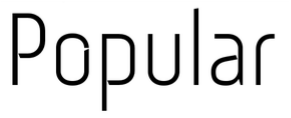  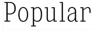   These are the tiltels my music magazine could have. I think it is good that they all have the word "pop" in it, because it tells the reader immediately that the magazine is about Pop music and Pop lifestyle. 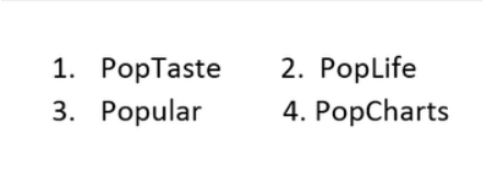
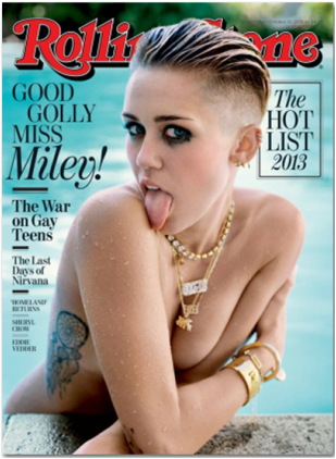
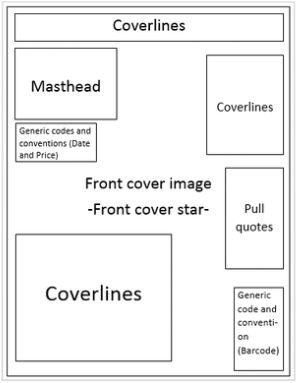
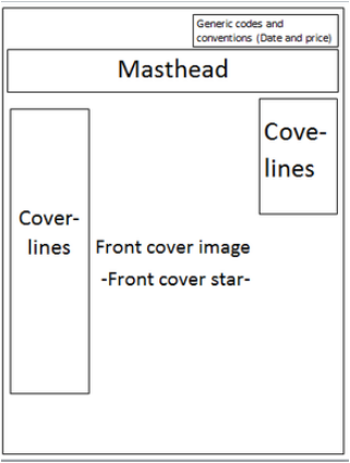
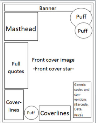
I created flat plans for these three different music magazine covers, to get an idea about how my cover for my own music magazine could look like.
I think I am going to make a version between the first one and the last one (NME and Q), because the mastheads are clearly visuable and easy recognizable. I also like that they both use so many coverlines or pull quotes to make the reader curious and they do not waste space. Whereas the Rolling Stone magazine waste lots of space. Besides I like it, that the Q magazine is using so many puff´s to draw the readers attention. |
AuthorLena Gläser |


 RSS Feed
