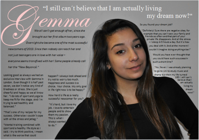
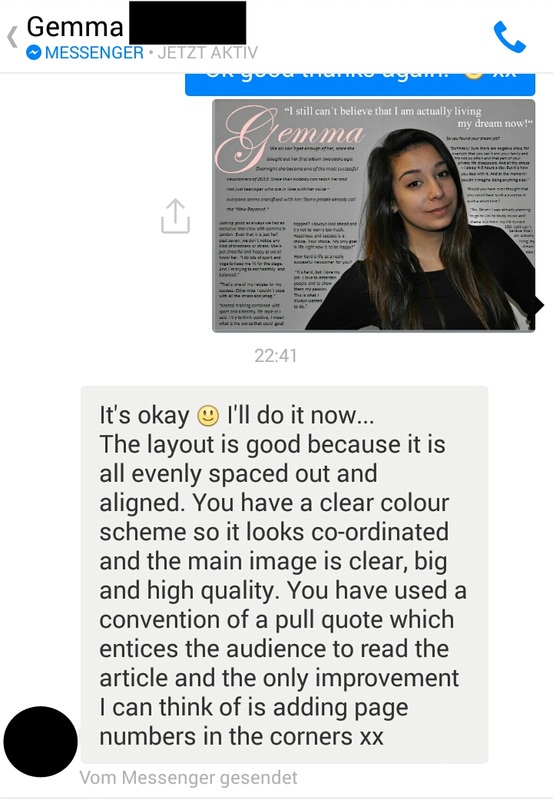
This is my first version of a double page spread fro my music magazine and some of the feedback below.
 |  |
 |  |
|
This is my first version of a double page spread fro my music magazine and some of the feedback below.
1 Comment
 Uncut magazine is a monthly publication based in London, which focuses on rock music. The first issue was launced in Ma 1997as "a monthly magazine aimed to 25 to 45 year old men that focus on music and movies." The former editor is Allen Jones and now it is John Mulvey. Jo Smalley is the publish director. The magazine is available in all English-speaking countrys, but it is also available on moblie phones, tablets, itunes, Googel play, Twitter and Facebook. Uncut's contents include lengthy features on old albums, interviews with film directors, music and film neews and reviews of all major new albums, film and DVD releases. Its music features tend to focus on genres such as Americana, rock and alternative country. Each month the magazine includes a free CD, which may include both new and old music. Uncut underwent a radical redesign in May 2006, as a result of which the magazine no longer catered for books and reduced and older content. Uncut's monthly circulation has dropped from over 90,000 in 2007 to 56,223 in the second half of 2013. A survey from IPC showed that 86% of the audience are men with the average age 37. The audience's favourite music genre are rock, classic indie and Americana. Uncut was voted twice the PPA (Professional Publisher Association) magazine of the year and the PPA international magazine of the year. Uncut is on out of over 90 brands from the big American New York based publishing company called Time Inc. It has a monthly global print audience of over 120 million worldwide digital properies that attract more than 120 million vistiors each month, including over 50 websites. Time Inc. is the leader in the US consumer magazine industry in print and digital audience as well as share of print advertising. Time Inc.'s global social footprint reaches 140 million people through Facebook, Twitter, Instagram, Pinterest, Google+ and YouTube and Time Inc. UK is Britian's leading publisher of print and digital magazine content. http://www.timeinc.com/ http://en.wikipedia.org/wiki/Uncut_(magazine)  Pitch for my music magazine:I decided quite early that genre for my music magazine is going to be pop, because this is the genre I am most intrested in and I like this kind of music. Because of the feedback i recieved for my choice of titles, I decided to call my magazine "Popular". I think it is quite a good name, because the term pop music originally derives from the word popluar. The magazine aims for a target audience between 16 - 35. The readers are likely to be white, quite young females, who like to listen to pop, indie and soul music. They also have a fashion intrest, because my magazine is a combination from the pop genre and the pop lifestyle. There will be features about fashion and beauty.
The magazine is going to be a montly magazine and it will included most genretic codes and conventions so as the date (month), the price, a barcode and a web-adress. The magazine articles will mostly feature exclusive interviews with stars and new comers. But there also will be articles about star gossip or articles about beauty and fashion. My colour scheme is white, black and pink and the layout will be quite simple and calm. It is suppose to look like a bit more grown up teenager pop magazine.     Blender was an American music magazine that billed itself as "the ultimate guide to music and more". It was also known for sometimes steamy pictorials of celebrities. It compiled lists of albums, artists, and songs, including both "best of" and "worst of" lists. In each issue, there was a review of an artist's entire discography, with each album being analyzed in turn.
In June 2006, the Chicago Tribune named it one of the top ten English-language magazines, describing it as "the cool kid at the school of rock magazines." Owner Alpha Media Group closed Blender magazine March 26, 2009, going to an online-only format in a move that eliminated 30 jobs and reduced the company's portfolio of titles to Maxim alone. Blender 's final print issue was the April 2009 issue. Subscribers to the magazine were sent issues of Maxim magazine to make up for the unsent Blender issues. -Wikipedia- Masthead analysis: On every issue of the Blender magazine, the masthead is at the top of the cover and it is the largest text on the cover. Because it is written in big, bold and usually colourful letters, it clearly stands out and draws the reader's attention. Blender uses differnt looking masthead on almost every issue. Most of the time the colour of the masthead depends on the colour schmeme of the cover. People connect something sharp or mixed stuff with the word "Blender" and therefore the cut trought the masthead links perfectly to what it sounds like. But especically by black mastheads they do not use the cut. Normally the word Blender is written again in small letters in the "B" of the actuall masthead and sometimes there is a banner under the masthead which says :" Your music buddy". I think that all these difference depend on when the issue was published, because they changed there style of the masthead over the years. Usually the masthead is mostly coverd up by the main image. This shows the confidence of the publisher, as he thinks that the magazine is quite well known and therfore the whole masthead does not need to be shown, but the reader can still regonize it. |
AuthorLena Gläser |
 RSS Feed
